Facebook AR/VR Commerce
Interstitial, Cart, and Checkout
UX, eCommerce, Digital Store
Revolutionizing Facebook's Portal eCommerce Experience
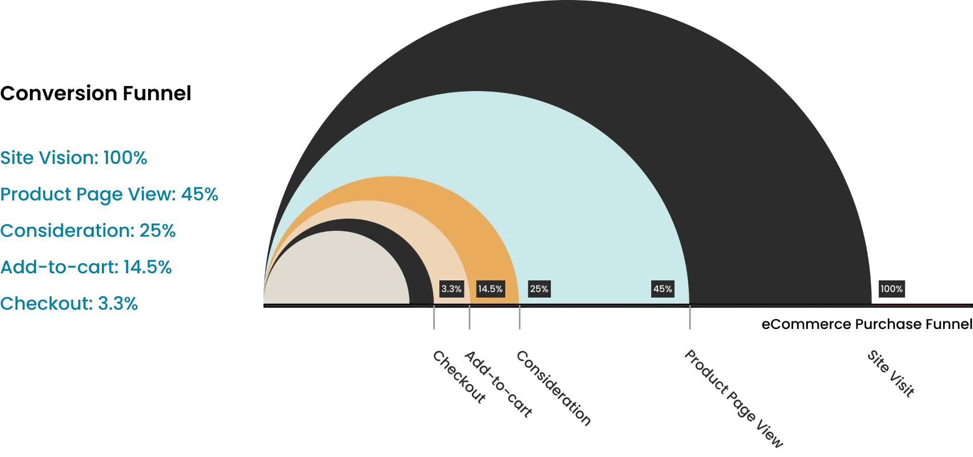
Facebook, a newcomer in the hardware industry, launched its Smart Display product line. As the design leader and founding member of the AR/VR Commerce Design team, my foremost duty was to establish a top-performing design team and collaborate closely with the storefront product team to create a comprehensive eCommerce experience that would boost brand recognition, generate awareness, elicit enthusiasm, and elevate revenue by delivering thoughtful and delightful shopping experiences to our customers. Our primary initiative was to revamp the conversion funnel by reimagining the Buy Modal (Interstitial), Shopping Cart, and Checkout flow to enhance the current Portal digital store.
Understanding User Problems
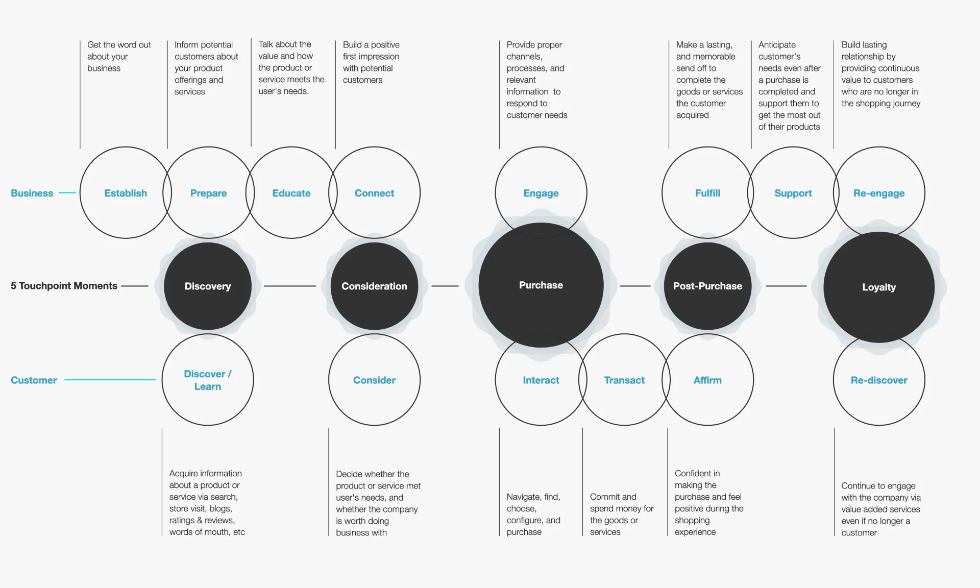
The Disconnect in Digital Shopping: One of the primary challenges we encountered was the disconnect between traditional brick-and-mortar shopping experiences and digital eCommerce platforms. While physical stores offer tangible interactions and personalized assistance, online shopping often lacks the human touch and immersive experience that customers crave. This disconnect led to a sense of detachment and frustration among users, hindering their ability to make informed purchasing decisions and fostering loyalty to the brand.
Navigating the Digital Jungle: Additionally, diving into the online world proved to be quite the adventure for users. Since this product category is still fresh, finding the right info wasn't as easy as pie. With so much to sift through, folks often felt overwhelmed, like they were lost in a sea of options. All this decision-making led to fatigue and left them feeling less than satisfied with their shopping experience.
Friction Points in the Conversion Funnel: As users progressed through the conversion funnel, they encountered numerous friction points that impeded their journey towards completing a purchase. Cumbersome checkout processes, unclear product descriptions, and hidden fees were just a few of the obstacles that users faced, leading to frustration and abandonment at critical stages of the buying process. Addressing these friction points was crucial to streamlining the eCommerce experience and maximizing conversion rates.
Strategy Overview
Our strategy was centered around creating an eCommerce experience that would address the user problems identified and drive meaningful engagement and conversion. By focusing on redesigning key touch-points such as the Buy Modal, Shopping Cart, and Checkout flow, we aimed to enhance usability, increase customer satisfaction, and ultimately drive revenue growth for Facebook's Smart Display product line.
Redesigning the Buy Modal (Interstitial)
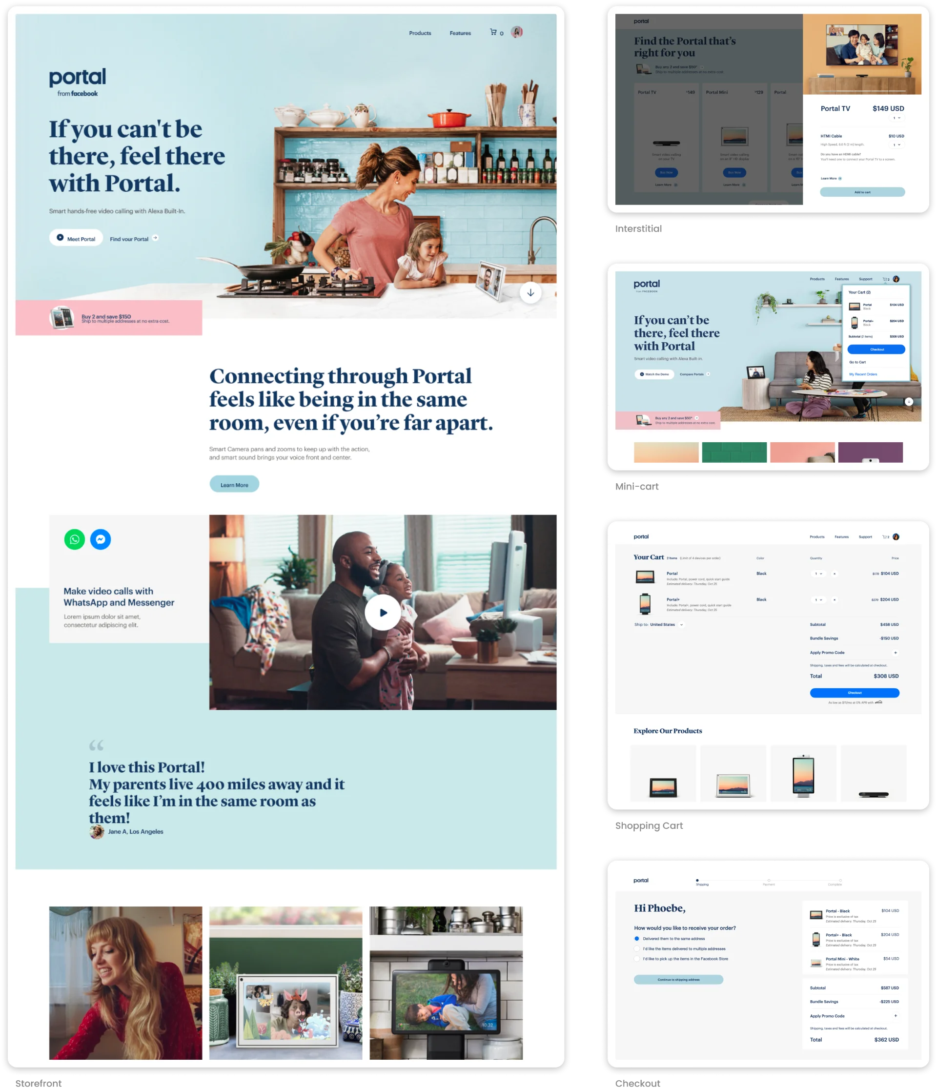
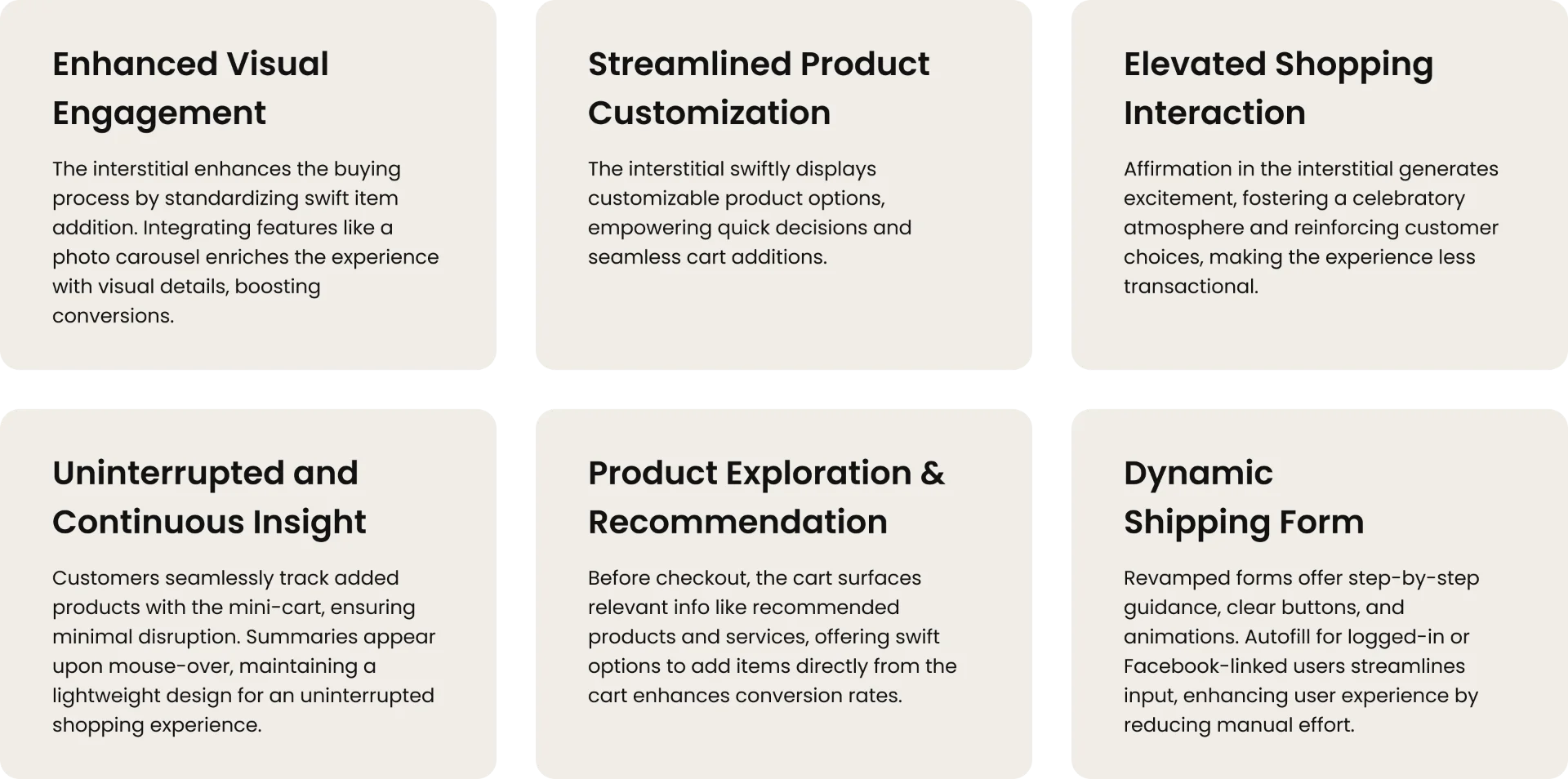
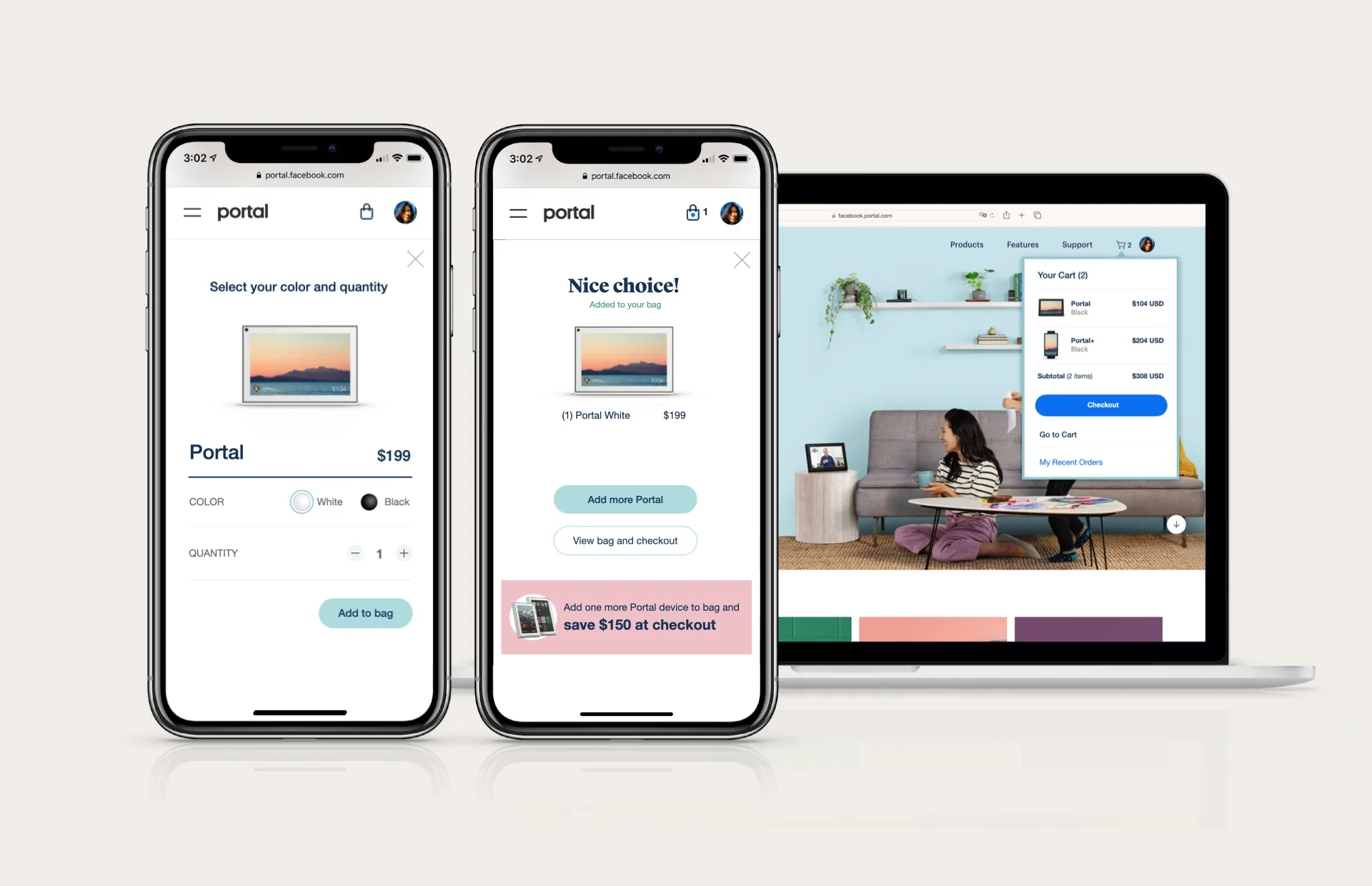
To address the disconnect in digital shopping, we focused on redesigning the Buy Modal (Interstitial) to provide users with a more immersive and informative experience. By incorporating interactive elements such as photo carousels and product videos, we aimed to bridge the gap between the physical and digital realms, allowing users to engage with products in a more tactile and engaging manner. Additionally, we introduced subtle animations and visual cues to signal to users that a product had been added to their cart, instilling a sense of excitement and urgency to complete their purchase.
Optimizing the Shopping Cart
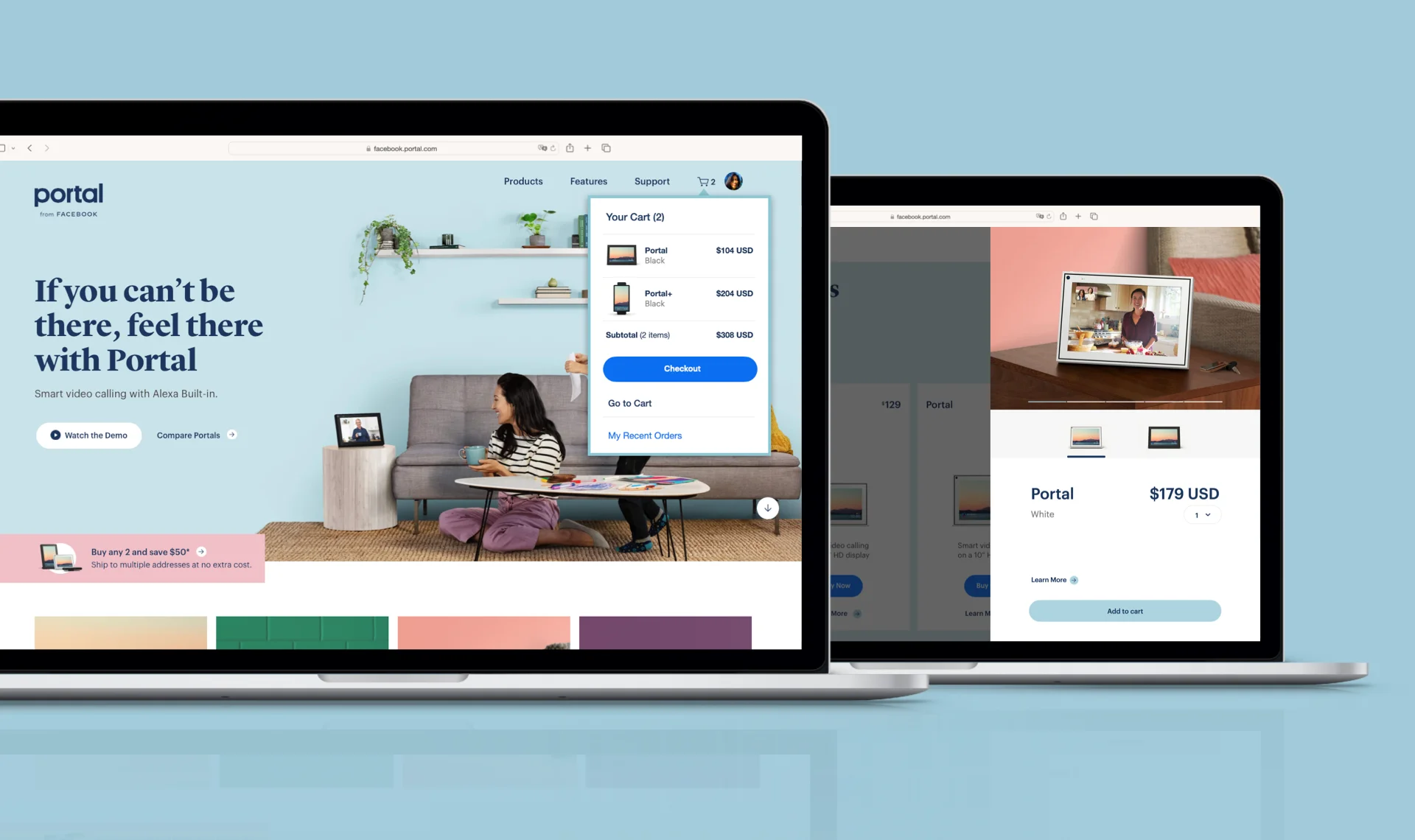
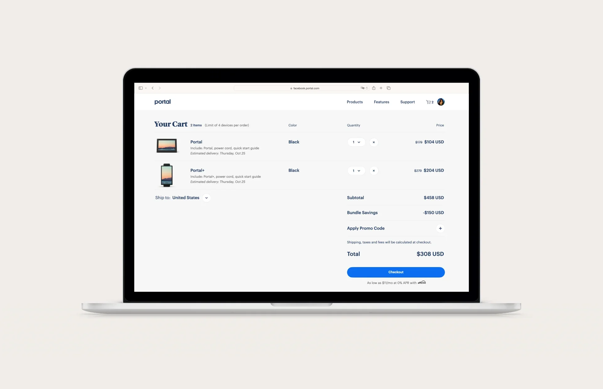
Recognizing the overwhelm faced by users in the digital landscape, we sought to streamline the shopping experience by optimizing the Shopping Cart interface. We introduced a mini-cart feature that allowed users to quickly view and edit their cart contents without navigating away from the product page, reducing friction and minimizing interruptions to their browsing flow. Furthermore, we enhanced the organization and clarity of the Shopping Cart page, providing users with a comprehensive summary of their selections and a transparent breakdown of pricing and shipping information.
Simplifying the Checkout Process
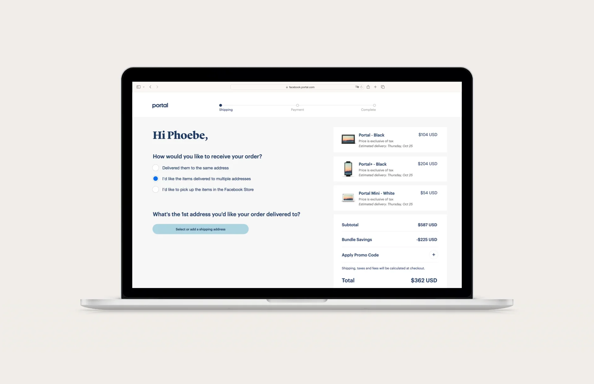
To address friction points in the conversion funnel, we implemented several improvements to the checkout process. We redesigned the shipping form to be dynamic and intuitive, breaking it down into manageable steps and incorporating real-time validation to ensure accurate and efficient data entry. Additionally, we introduced contextual help prompts and tooltips to guide users through the checkout process, providing them with the assistance they needed to complete their purchase smoothly and confidently.
Outcome
Through strategic design enhancements and a user-centric approach, Facebook's Smart Display eCommerce experience underwent a remarkable transformation. The revamped Buy Modal, Shopping Cart, and Checkout flow not only addressed user problems and friction points but also elevated brand perception and customer satisfaction. With a focus on innovation and customer-centric design, our team played a pivotal role in shaping a best-in-class eCommerce experience for Facebook's Smart Display customers. Moving forward in this ever-changing eCommerce space, we collaborated with our cross-functional team to propose ongoing monitoring and optimization of the redesigned features based on user feedback and analytics. Continuous collaboration between the design and product teams will enable org-level alignment with business objectives and evolving user needs. Additionally, through regular usability testing and iteration to refine the eCommerce experience, Facebook AR/VR Commerce will maintain a competitive edge in the market.
Contribution
Design leadership
Design strategy
Design execution
User interviews
Work flow design
Product definition
Feature benchmarking
Feature definition
Interaction design
Visual design
