Simplify your smart home, all in one screen.

The SmartThings app supports over thousands of IoT devices, but navigating through them to check statuses or perform simple actions can be challenging. To address this frustration, we've created a dashboard that consolidates everything in one place, allowing users to manage their smart home effortlessly without ever leaving the app's main screen.


What Do Users Want?
Given the ambiguous nature of IoT, many users still struggle to articulate the need for connected devices in their daily lives. With this in mind, we began engaging with users to understand their goals in acquiring connected devices and what they want to see in the application while building their smart homes.


Peace of Mind: “I want to know the current status of my home, so that I can have peace of mind.”

Focused Attention: “I want to be able to favorite items, so that I can focus on a few things that I care about.”

Quick Glance: “I want to see the favorited items on one page, so that I can easily glance at the status of my home.”

Efficient Control: “I want to have direct access to device controls, so that I can change settings without a lot of navigation."

Prioritized Management: “I want to be able to manage my favorited items, so that I can prioritize based on my preferences.”

Group Control: “I want to favorite a group of devices, so that I can control many things at once.”


UX Design Tenets

Dashboard is scaleable
Looks good with one item or many items.
Looks good on various phone and tablet screen sizes.


Dashboard is easy to glance and understand
Easy to view and understand the overall status of the home.
Easy to view and focus on individual status of a device.
Easy to understand by novice users. (Will my mom be able to understand the information shown on the Dashboard? Can my house guests use it without a lot of guidance?)


Dashboard shows information that matters to the user
Info is meaningful. The user can understand what it means and can take action accordingly.
Info is purposeful. The info appears because it needs the user's attention. (e.g. alerts, tips to help achieve goals)
Info is clear, concise, and selective.


Dashboard allows the user to customize, manage and prioritize information
The user can rearrange items based on their preferences.
The user can scan the hierarchy of importance.


Current Dashboard Issues


Adding Items to Dashboard


Dashboard Design – Phone and Tablet


Impact

The Dashboard feature enables users to favorite devices and automations, utilizing a card metaphor to organize and customize these items according to their needs. Its simple and clean design minimizes screen clutter while providing sufficient information for users to monitor their devices and home status. This solution effectively addressed common user issues with the SmartThings app. As a result of my design work, the app's star rating significantly improved from 1-star to 4-stars.


SmartThings

SmartThings App Dashboard (IoT)

UX, Mobile App, iOS, Android

Dashboard usability was the most complained about feature in the SmartThings mobile application because of its lack of useful functions and unappealing experience. As a result, the app received a low star rating. Being the design lead, my objective for this project was to identify the pain points and create an experience for users to help organize their IoT devices and automations that they cared about most.

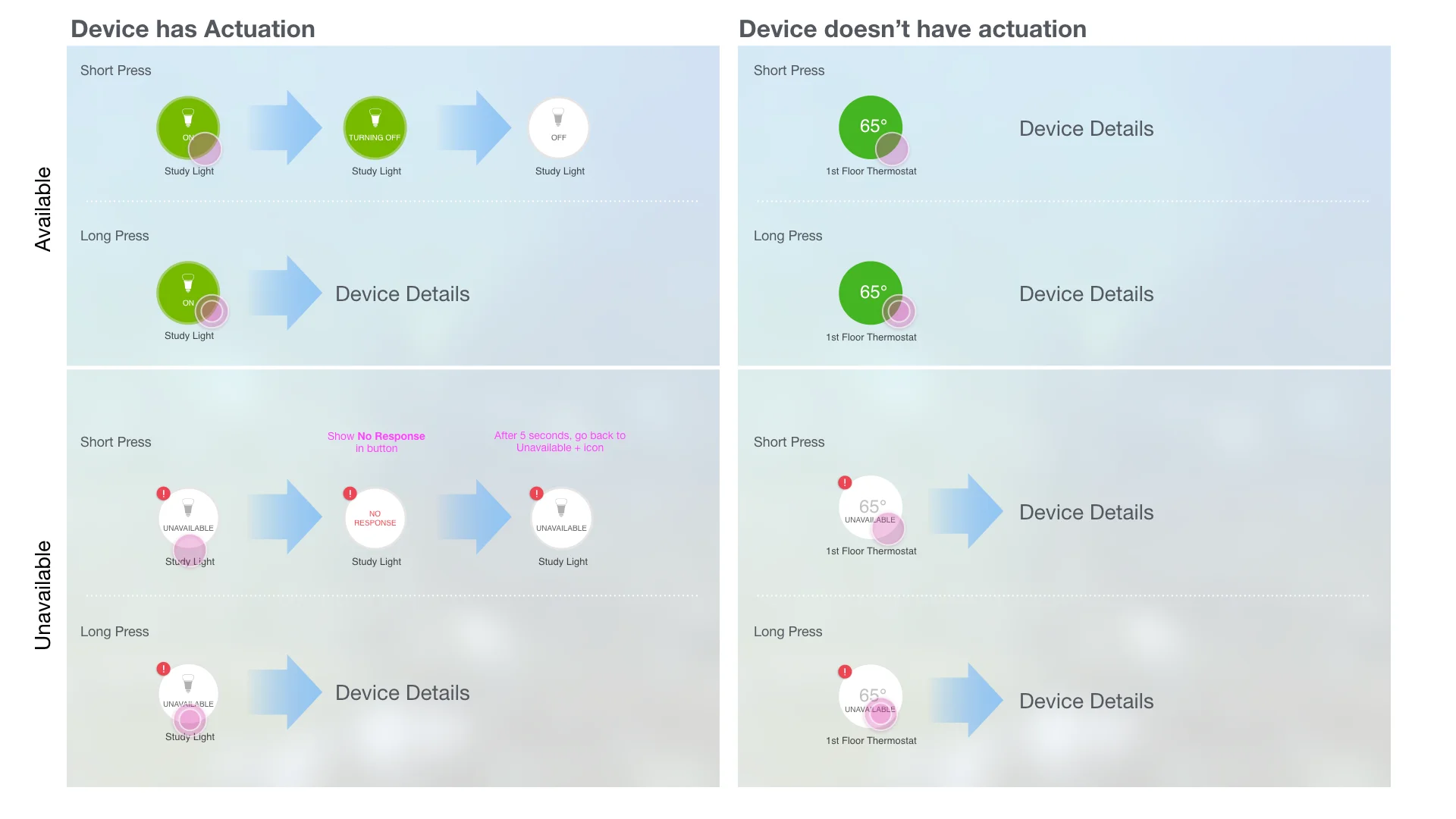
With the SmartThings app, more than three hundred supported devices can be connected to the IoT platform. However, it also leads to the problem of difficulty in navigating to the desired devices to view device status or perform simple actuation. The dashboard was created to solve this most frustrating issue and at the same time to provide a single place where the user can perform tasks for their smart home without leaving the first screen of the app.

Dashboard allows users to favorite things and automations. The card metaphor creates an organizational structure for the user to arrange and customize the dashboard items that suit their needs. The simple, clean design avoids clutter on screen but still provides enough information for the user to view statuses of their devices and home. While addressing the problem that most users had with SmartThings app, the Dashboard design also helped raised the SmartThings app star rating from 1-star to 4-stars.


Contribution

  • Technology research
  • User research
  • Work flow design
  • Concept generation
  • Product definition
  • Feature benchmarking
  • Feature definition
  • Interaction design
  • High fidelity wireframes
  • Visual design